Trippmatch
Trippmatch is a social travel site which uses machine learning to match its users with experiences based on their preferences and interests. Helping them plan their next big adventure!
Opportunity
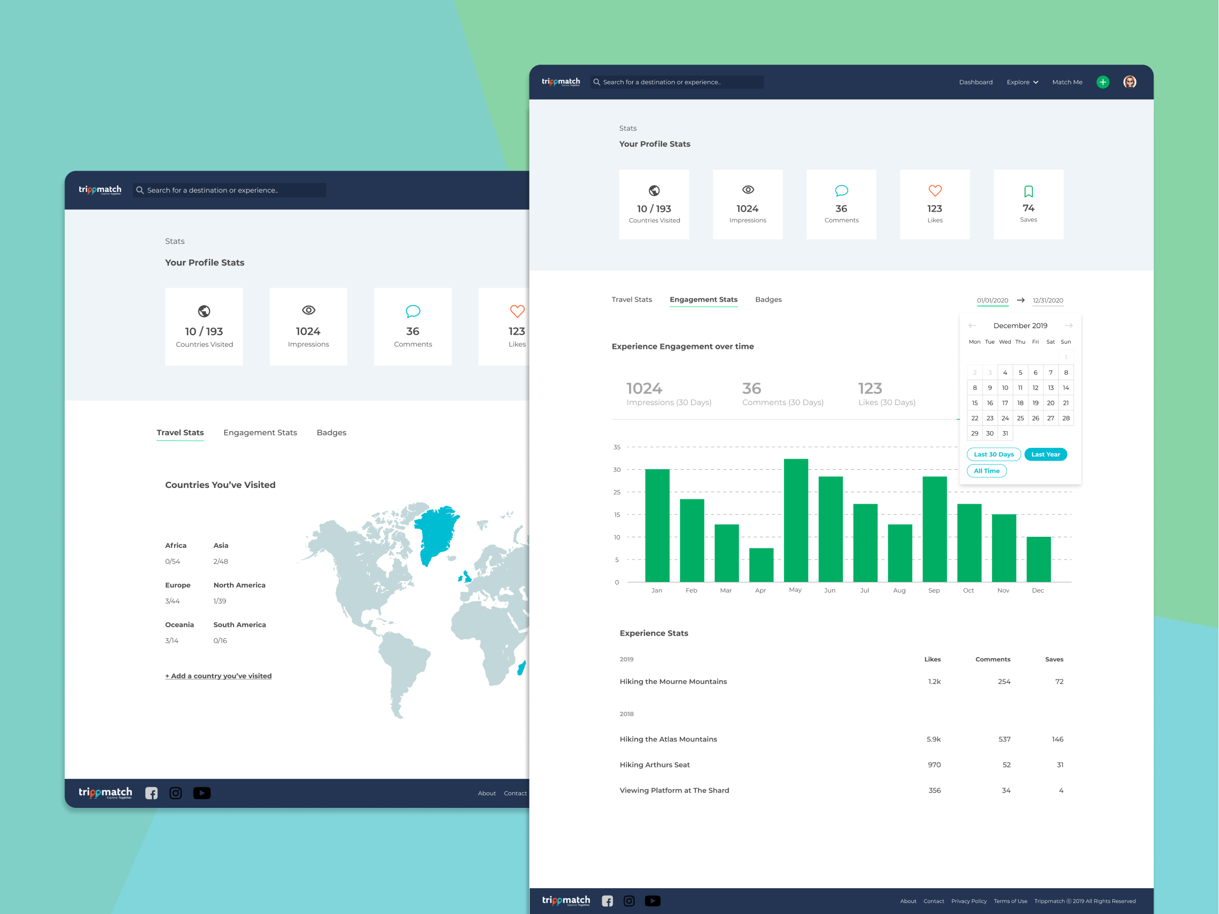
I worked with Trippmatch on a redesign of their existing social travel site looking at both the desktop and mobile experiences.
The initial opportunity for Trippmatch was to improve upon and expand the sites usability and functionality through a redesign while at the same time implementing machine learning to ensure users were being shown the most relevant content to their interests.
Project kickoff
When we first came on board with Trippmatch they had already been through a few iterations of the site, it was really helpful for us to see what had been done before and gave us some good insight into what the client liked. We combined this with extensive competitor and comparator research to guide us in the design and feature prioritisation.
We also conducted an initial survey with existing users to get general feedback and gather data on how they currently go about planning trips and looking for inspiration.
“It’s good that you aren’t forcing people to sign up, that you can look around at the content. It’s totally different.”
Iteration and validation
It was important from the start to work closely with the developers to ensure what we were capturing fed into the matching service properly and that we were displaying the correct information at each step in the users journey.
We combined this with continuous feedback from internal stakeholders to guide the designs to ensure they met business requirements.
Once we had the main flows completed we were able to carry out some first click and maze testing which highlighted some small areas for improvement.
“It's a really unique idea which I reckon is good, everything can seem really overdone these days. You guys did such a good job.”
Development handover
The front end developers started working on the design once a large chunk of the work had been completed. We wanted to create a component library which would make it quicker to build screens out. I had designed the screens on an 8px grid which made it simpler for the developers to implement spacing consistently across the site.
Once we had the main screens built out we were able to conduct remote user tests with existing users. This was very helpful and we were able to get a lot of insight into how users are likely to use the platform and we were able to make some quick changes which made a big impact on the usability of the site. We also got very positive feedback on the redesign and users seemed excited to start trying it out.

